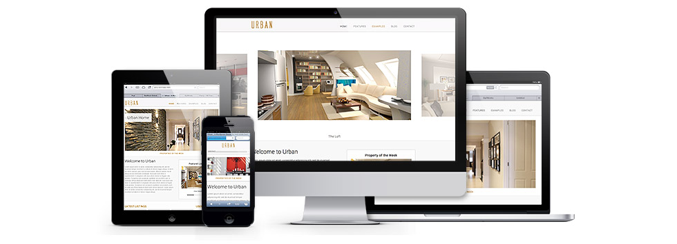
A fully responsive theme
built with a mobile-first framework.
What is Mobile First
Mobile first shifts the paradigm of a Web-site user experience. Instead of users’ viewing desktop versions of Web sites on their mobile device with some adjustments, users are now viewing sites that have been created specifically for their mobile device. This begs the question: how will stationary, desktop computer users view these Web sites? They’ll still view versions of Web sites that were developed for the desktop Web—but designed with mobile in mind. This means designers should tailor site user experiences to the needs of users who are on the go and in multiple contexts. Text must be easier to read and navigate. Photos and maps should be easily accessible, and all content should adjust to display properly on the device on which a user is viewing it.
By Riley Graham
Why Mobile First
Uploaded on Aug 23, 2011
Mark Brown, Senior VP of Communications Planning at The Garage/Team Mazda, discusses the growing importance of mobile and putting mobile first.
The Framework
What’s in the new ‘320 and Up’?- Five CSS3 Media Query increments: 480, 600, 768, 992 and 1382px
- Design ‘atmosphere’ (colour, texture and typography) separated from layout
- Bootstrap styles for buttons, forms and tables
- Modernizr, Selectivizr, responsive type tester and design tester
- LESS and Sass mixins and variables
- Upstarts for the things we build every day
by Andy Clarke and Jina Bolton
--from http://stuffandnonsense.co.uk/projects/320andup