Listing Input

Zillow · 2021

A web application for real estate brokers and agents to publish listings to multiple markets — one task, 200+ input fields.

Role
Lead UX Designer
Focus
Web · Redesign · B2B
Listing Input application

The problem

Users have one main task — publish listings — but doing it means filling out 200+ input fields across multi-select, single-select, text blocks, date pickers, phone numbers, and more. We had a tight timeline and no resources for user research, only scattered feedback and complaints.

I simplified the process to four steps: audit, ideation, design, and lightweight user testing.
Audit &
pain points

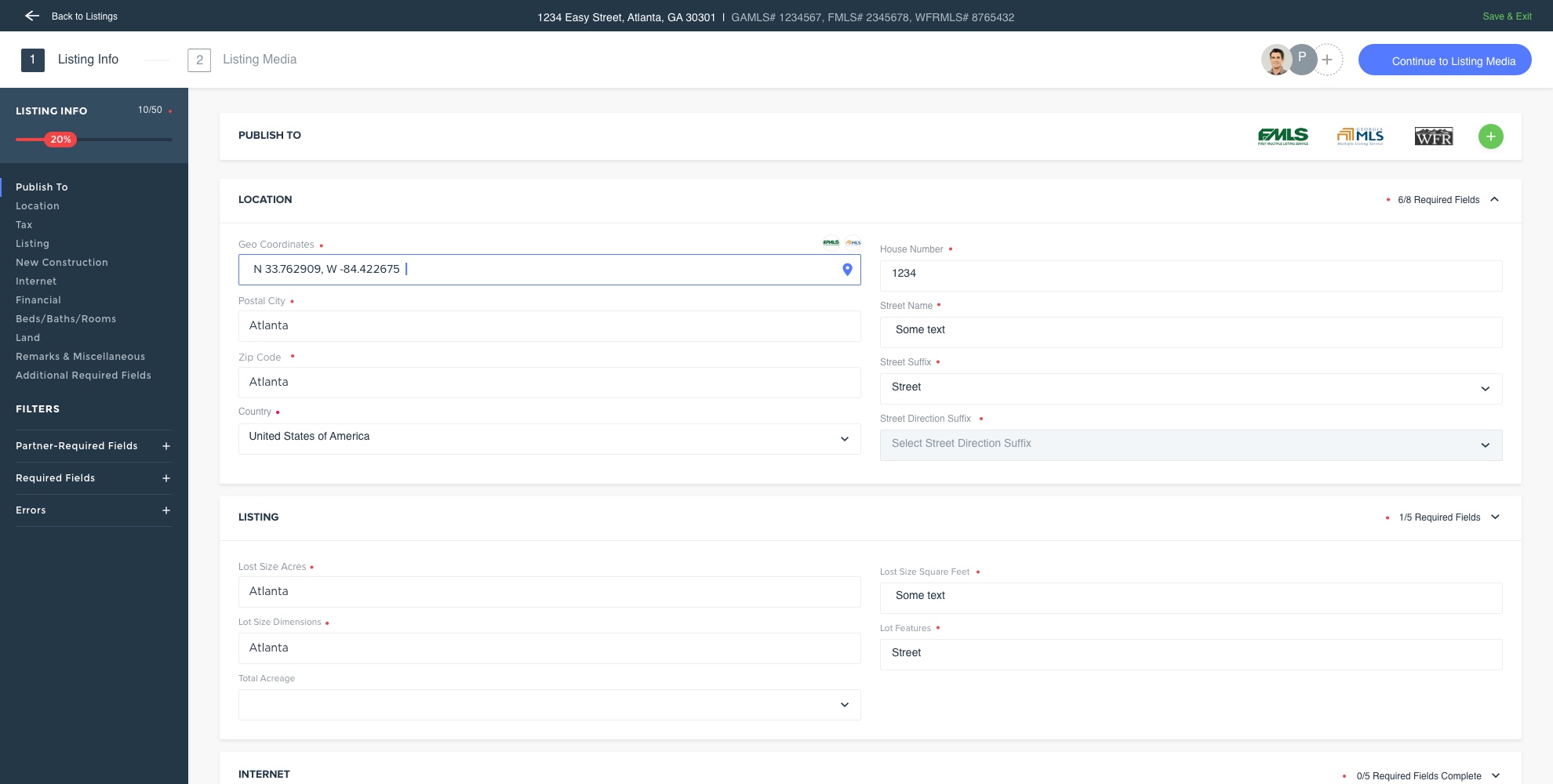
I audited the existing application against common UX standards and compared my notes with user feedback to identify the areas that needed the most improvement.

  • ·

    Navigation. Mixing filters and process steps made the navigation very confusing.

  • ·

    Form fields. Full-screen-width fields were hard to read and follow.

  • ·

    Undiscoverable features. Expandable cards were hard to find because of the content width.

  • ·

    Overwhelming fields. Too many inputs on one card made it hard to find a specific field.

  • ·

    Accessibility. Low-contrast colors, tiny text, and non-standard required field indicators.

Audit — existing application pain points

Market research

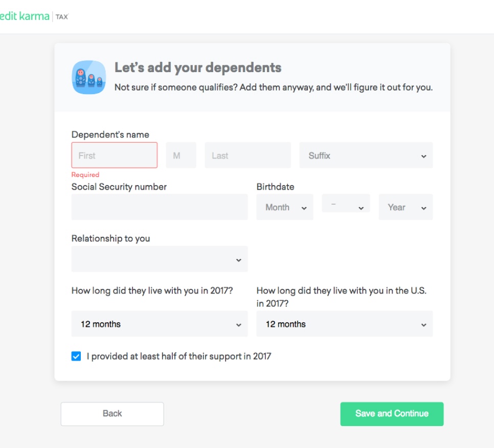
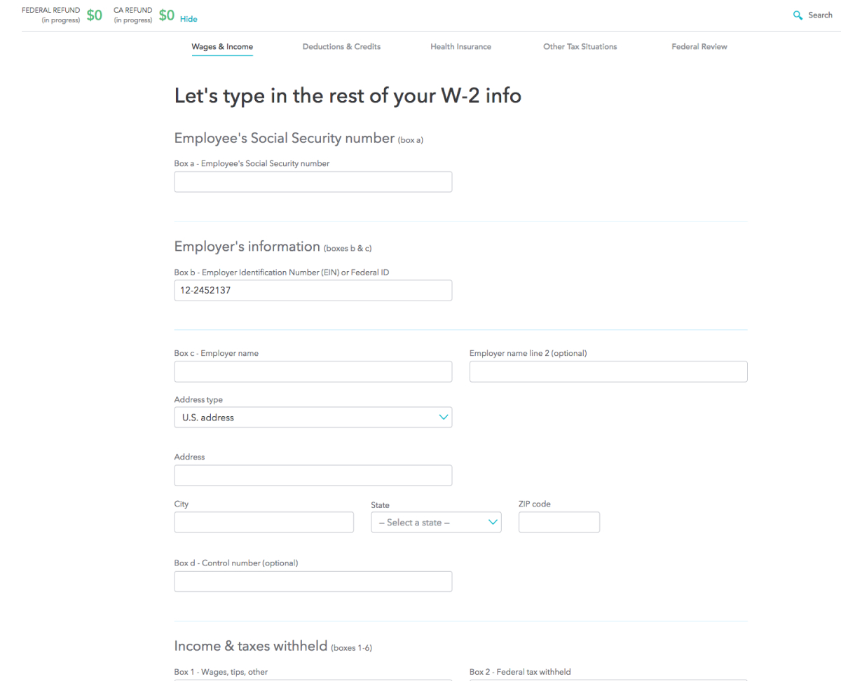
I researched products built for entering large amounts of data — Credit Karma and TurboTax stood out for engaging users and helping them complete tasks fast. The team agreed a wizard-style form would work best.

Inspiration from Credit Karma
Inspiration from TurboTax

Ideation

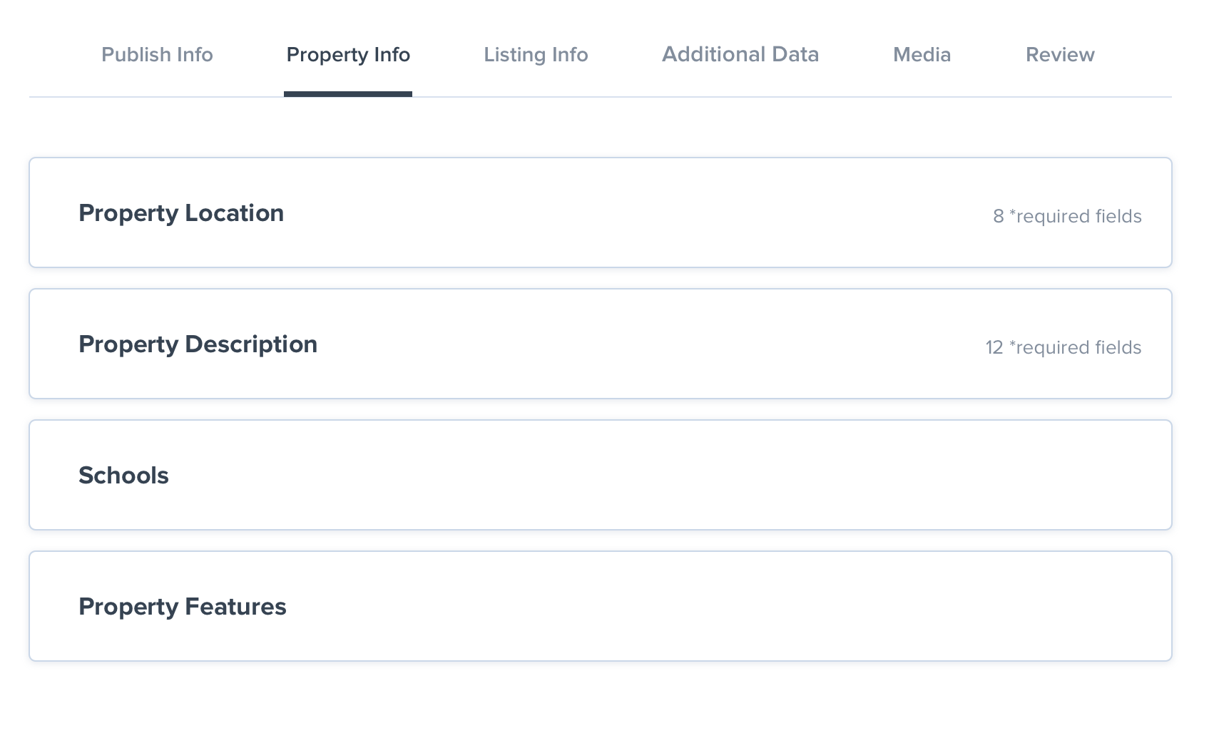
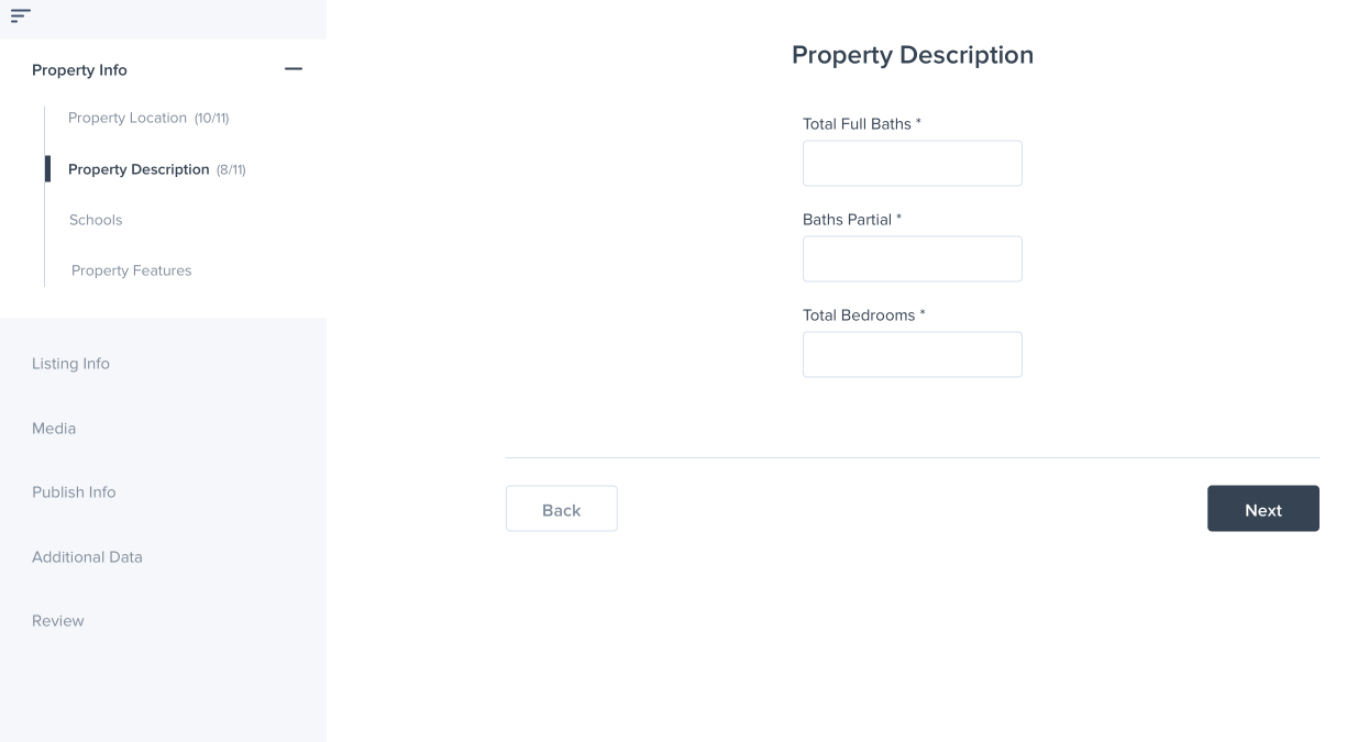
I explored vertical and horizontal navigation layouts. Horizontal navigation gives a glance at each step but doesn't scale. Vertical navigation has a clear hierarchy, scales well, and worked with our existing codebase — so that's what we chose.

Horizontal navigation layout exploration
Vertical navigation layout exploration

Solutions & design

Every design decision mapped back to the audit findings — clearer navigation, readable fields, better grouping, and accessible patterns throughout.

Navigation
Two-level guided flow
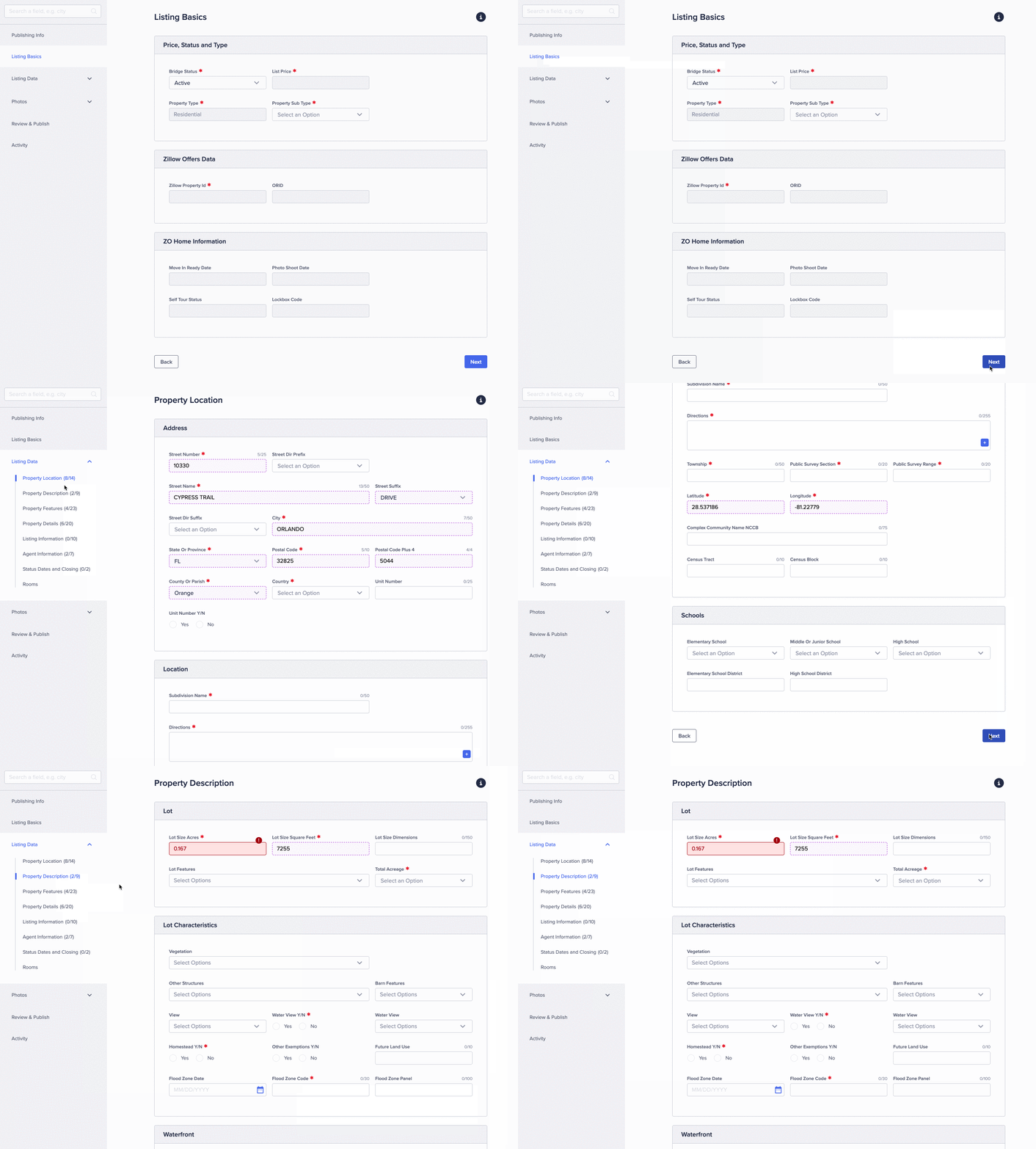
Left navigation follows the steps to complete a listing. A guided flow with a Next button mirrors the nav, so users can follow sequentially or jump to any step.
Two-level navigation and guided user flow

Field width
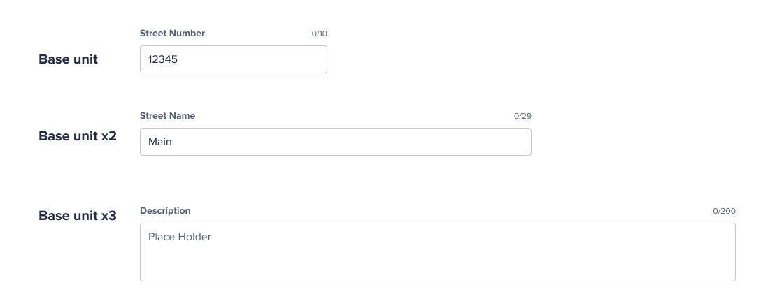
Grid layout with base units
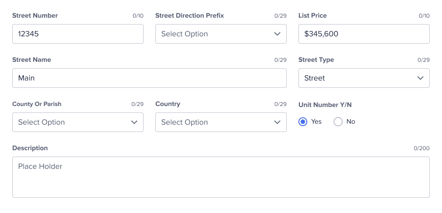
A base unit sizes the smallest fields. Longer inputs use 2× or 3× units. Min and max card widths keep fields from stretching too wide — a single column isn't practical for 200+ fields.
Base unit grid system
Assembled grid layout

Grouping
Cards, always visible
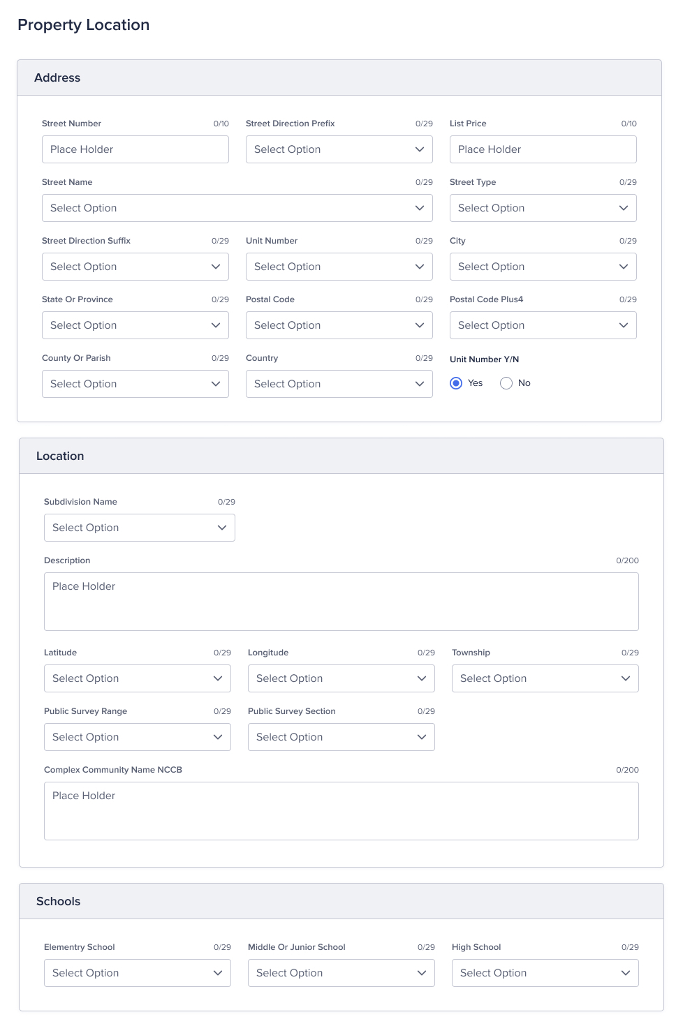
Fields are grouped into cards per step for clear hierarchy. Users keep all fields open to scan what needs filling — so expandable cards were removed.
Form field grouping with card layout

Accessibility
WCAG AA compliance
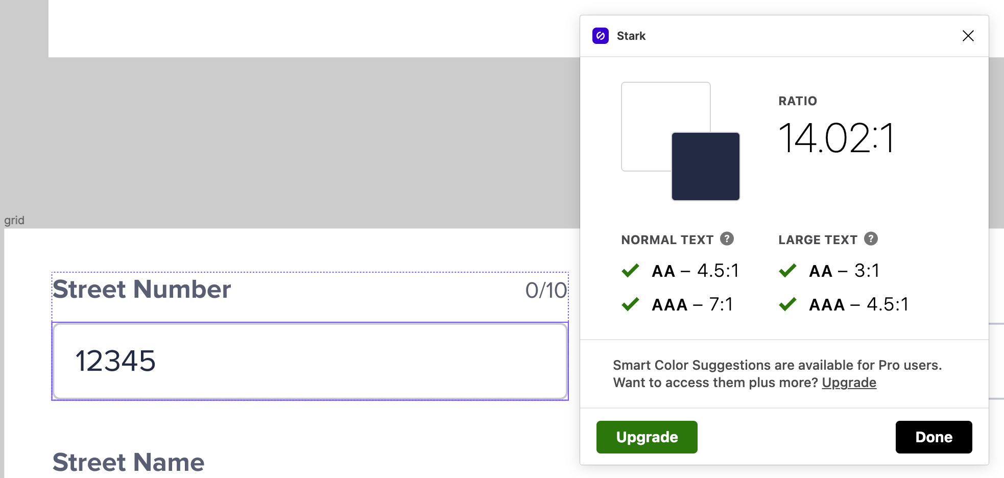
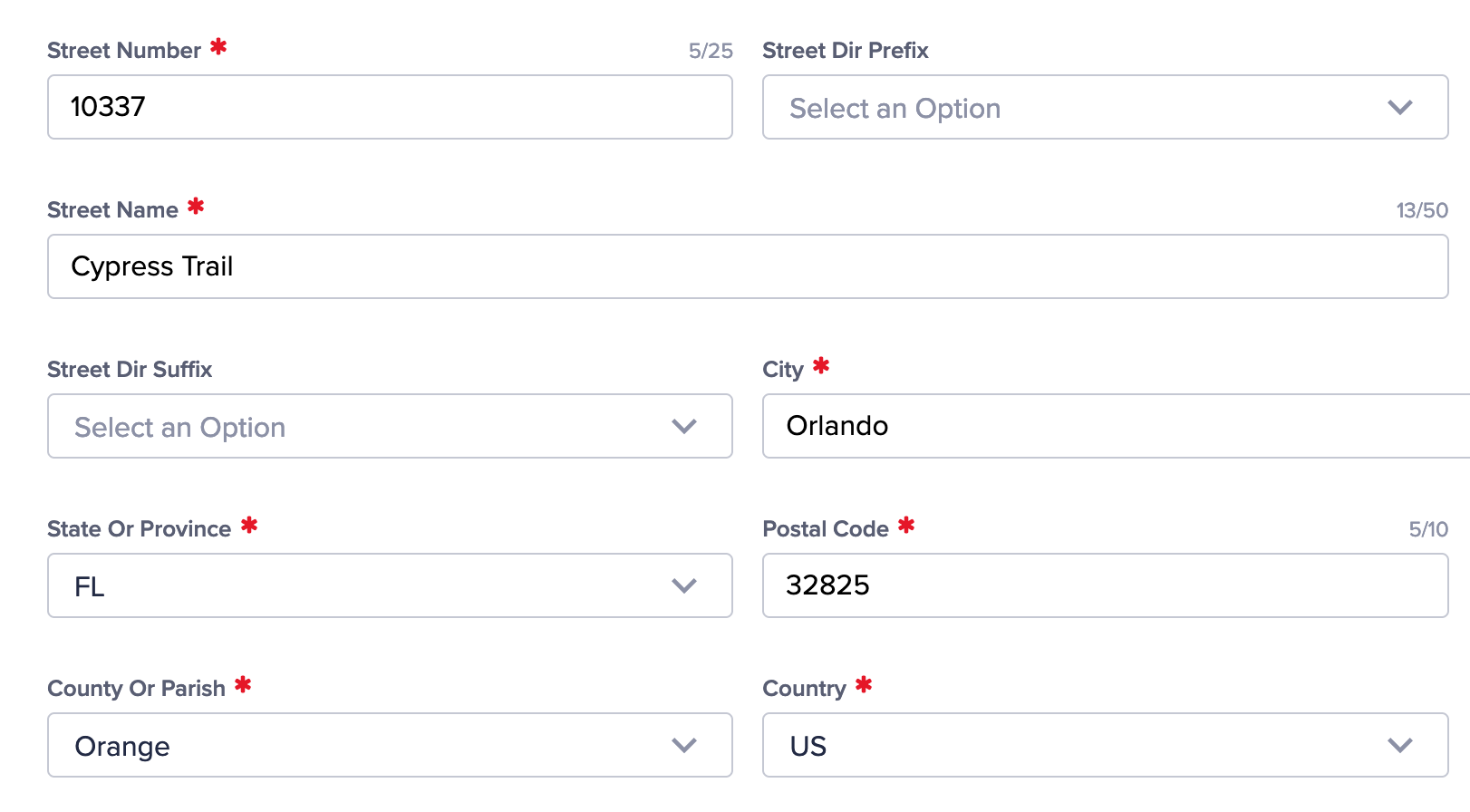
Updated colors and typography to meet WCAG 2.1 AA standards using Stark in Figma. Required fields now use a standard asterisk.
Accessibility color and type updates
Standard required field indicator

Automation
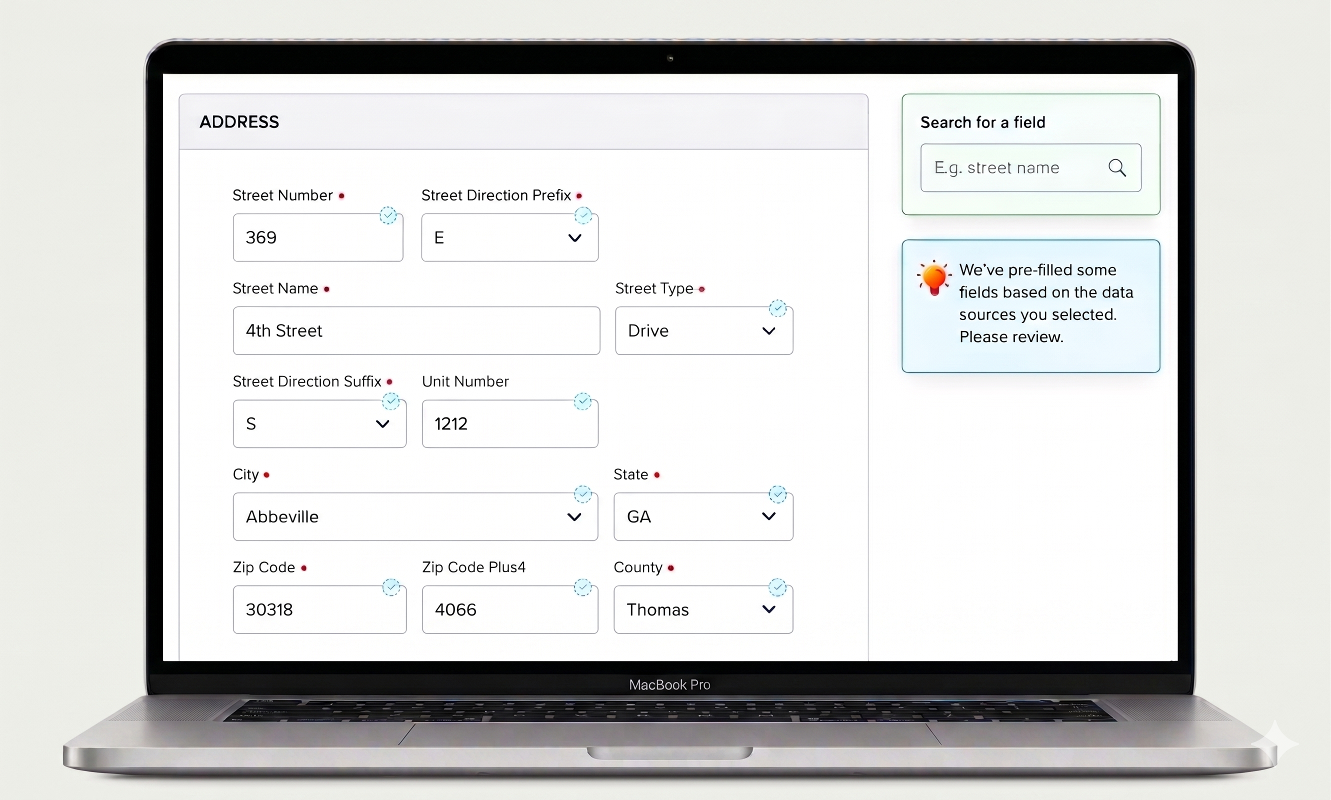
Smart auto-fill
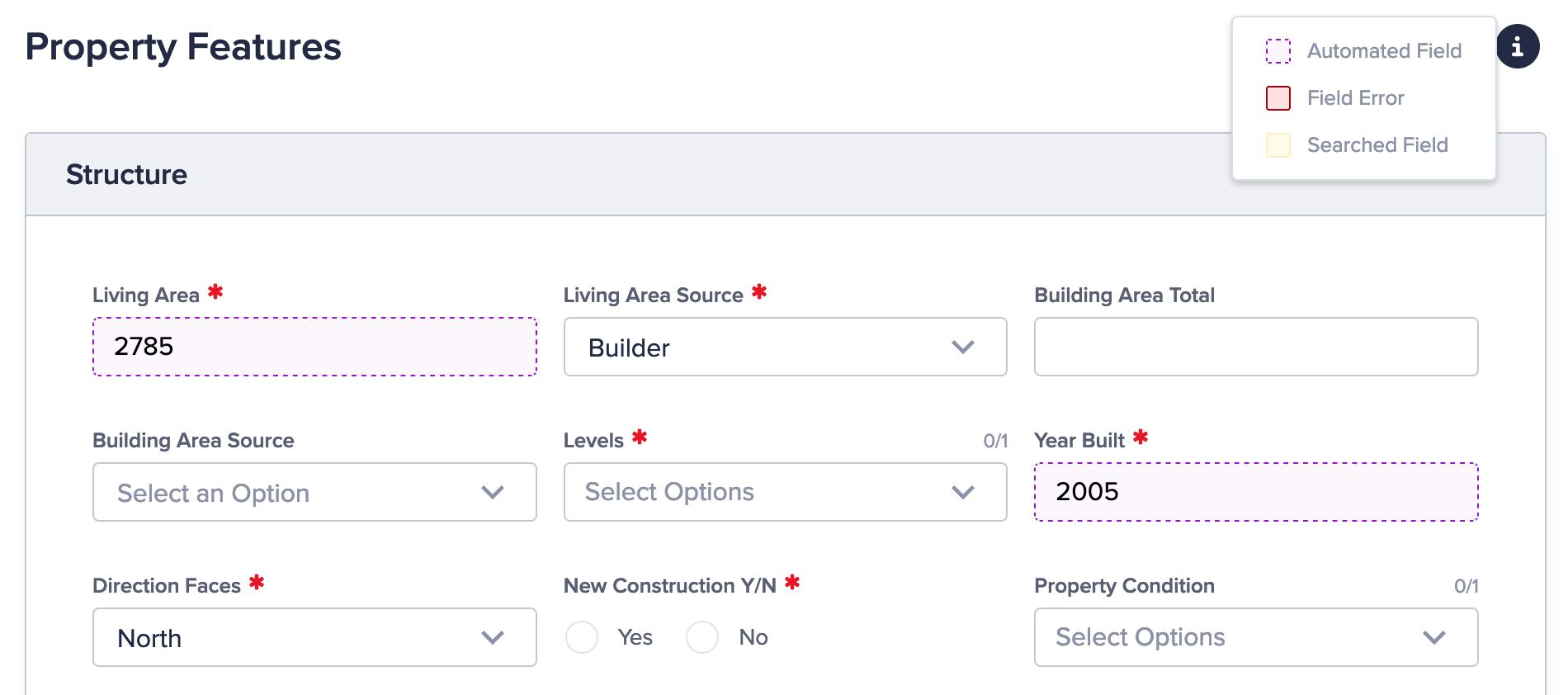
Some fields auto-fill based on already-entered data. Automated fields are clearly marked so users can review and override them.
Automated field indicators

Preview
Actionable review
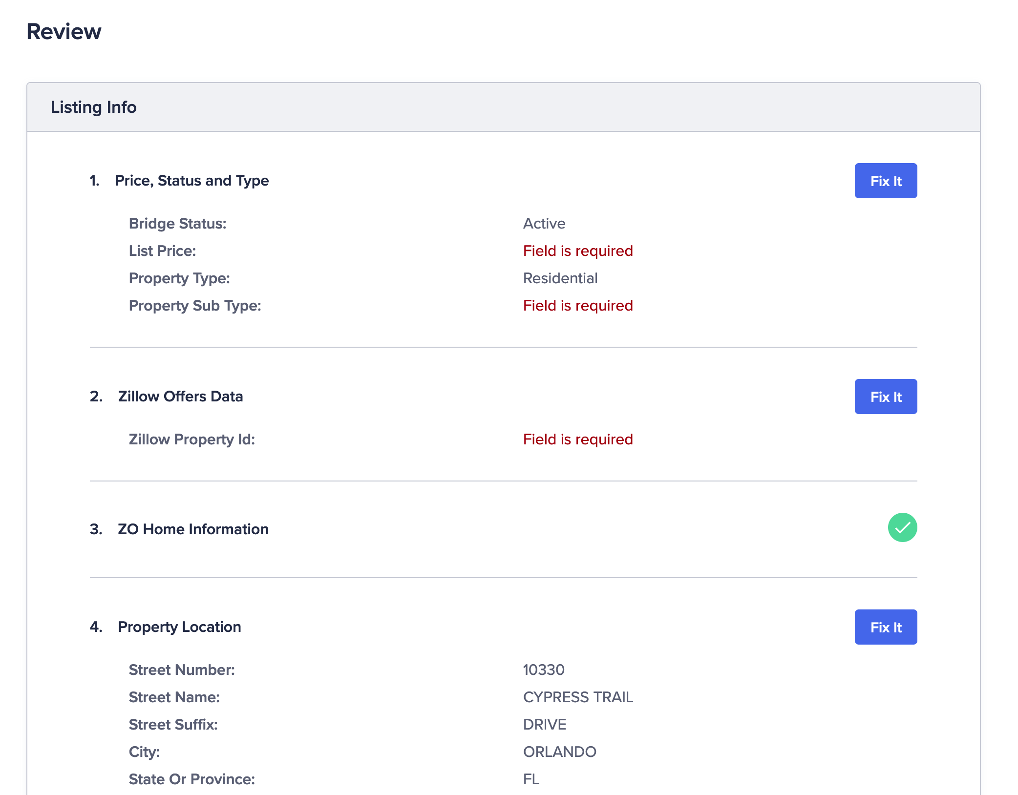
The preview page lets users click buttons to jump back and fix issues — not just read a static summary.
Preview page with actionable buttons

Text areas
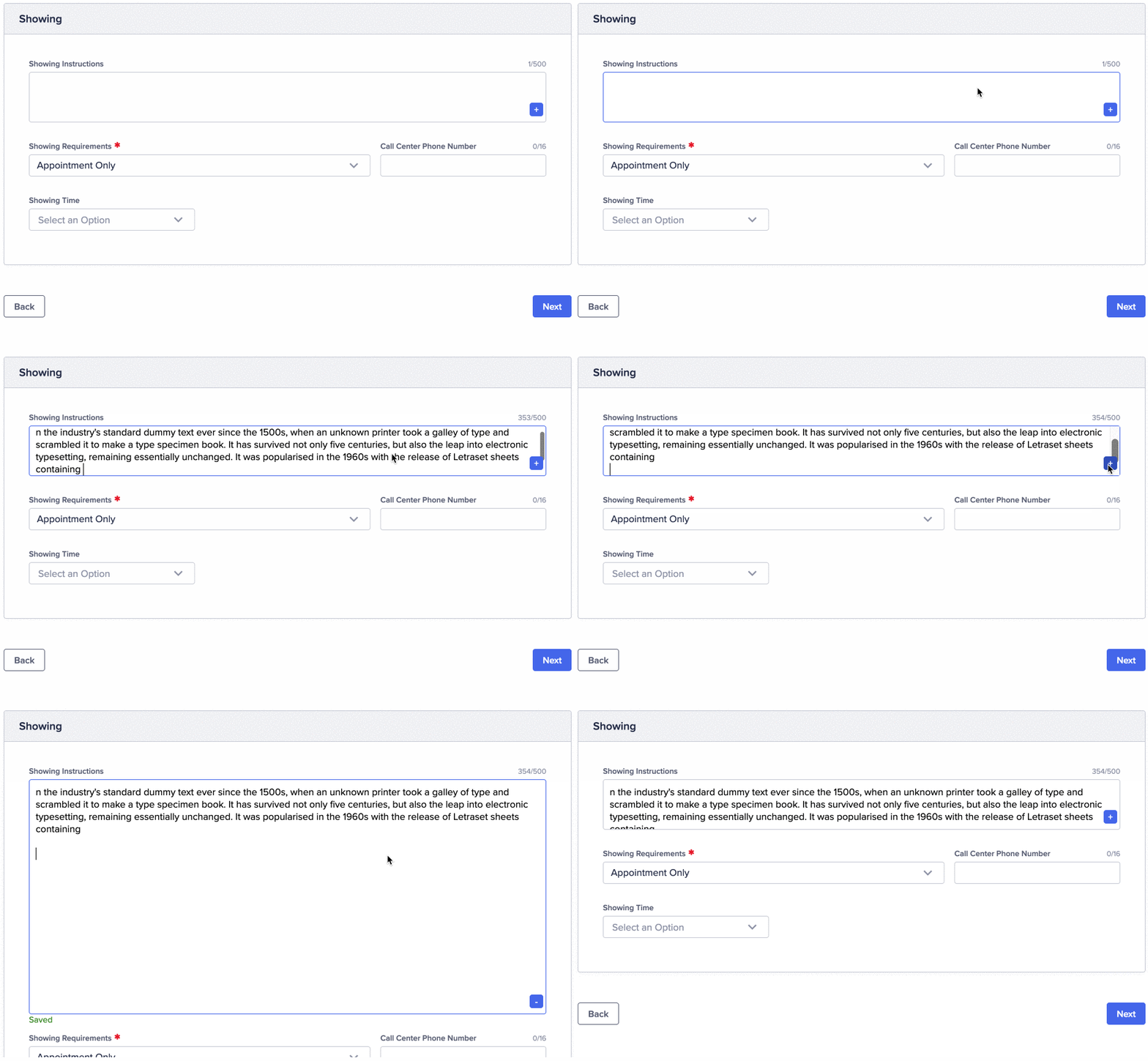
Expandable on demand
Text-area fields expand to fit short or long content without taking up unnecessary space in the default view.
Expandable textarea field

User testing

With no time to build prototypes or recruit external testers, I walked across the office and found five colleagues in another department who use the product as part of their job. I showed them the design files and asked them to think out loud as they clicked through.

The user flow was easy to follow and navigation was clear — no major issues. We captured suggestions for future iterations and moved straight to build.

The outcomes

+83%
Work efficiency improvement
66%
Agent adoption in 3 months

More work

Zillow
Builder Dashboard
View case study →
Zillow
Concierge Web App
View case study →
Meta
Facebook Reels In-stream Ads
View case study →